James Ready
Rebrand

Rebranding a 100+ year old Canadian icon, for the modern consumer and old faithful, alike.

Our Contributions

  • Brand Strategy
    Audience Segmentation
    Identity Design
    Typography
    Packaging Design
    Content Production

For over a century, James Ready has held a beloved place in the Canadian beer market, passed from generation to generation like a rite of passage. But as the landscape shifted and younger drinkers entered the category, the brand’s identity felt increasingly dated. James Ready needed to grow — without losing the loyal fans that made it an institution.

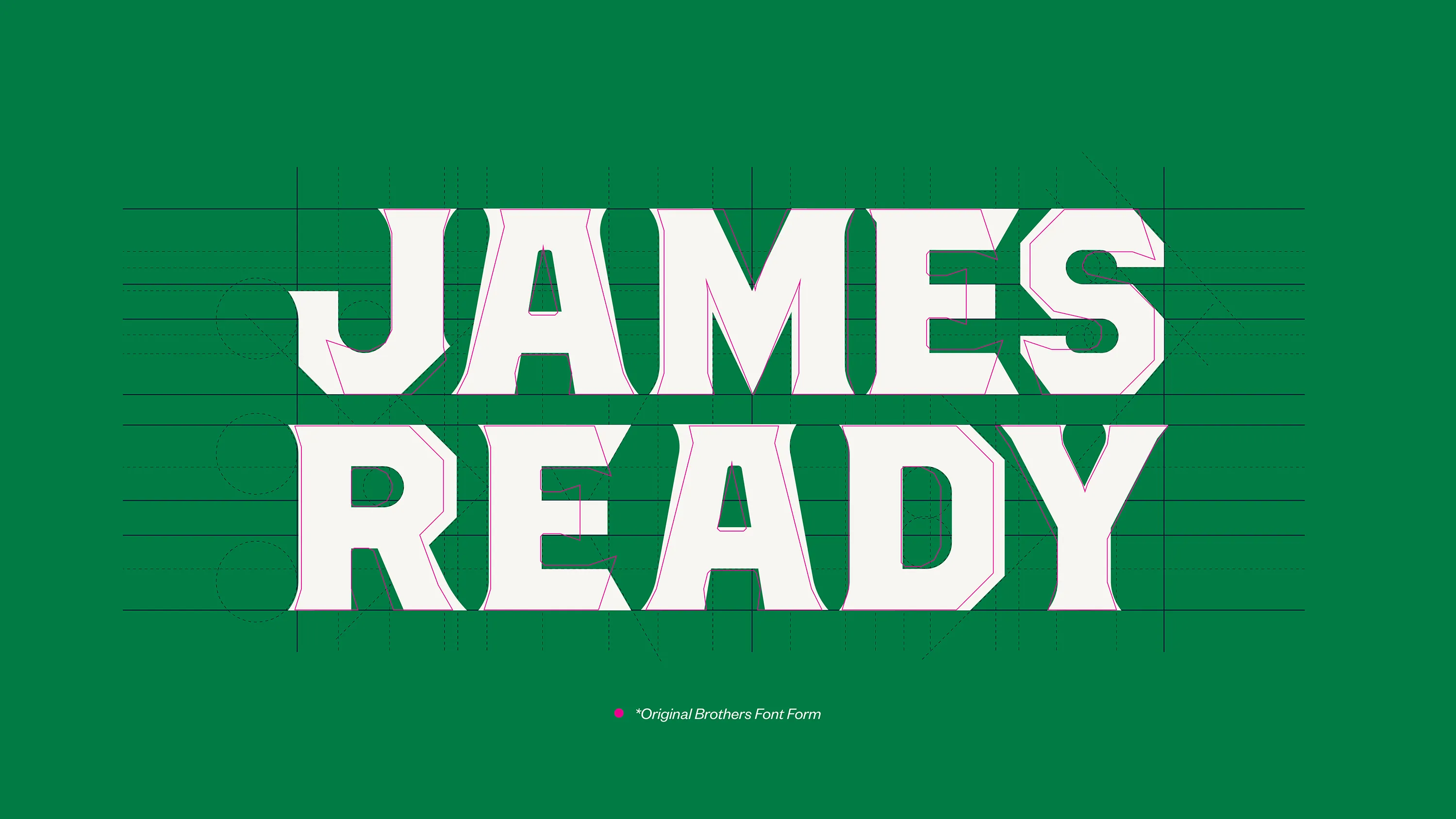
Our mission was to honour the brand’s rich history while building a refreshed identity that felt both timeless and modern. We needed to create a visual language that stayed true to James Ready’s roots, but was sharp enough to attract a new wave of drinkers who value heritage — and authenticity.

We began by stripping the brand down to its core. At the heart of James Ready was the Scottish Rampant Lion — a powerful symbol of resilience, pride, and legacy. We distilled the lion to its purest form, using circular geometry balanced with sharp edges to create a refreshed mark that felt cleaner, stronger, and more timeless, while still paying homage to its Scottish heritage.

Every detail was intentional. The new lion strikes a balance between boldness and simplicity — a visual cue built to stand out whether stocked individually in a beer fridge, stacked in flats, or buried under a mountain of ice. It’s an evolution that commands attention, without losing the character that made James Ready iconic in the first place.

Typography played a critical role in unifying the new brand system. Drawing inspiration from the signs, logos, and vernacular typography found in rural Canada, we chose to base James Ready’s new letterforms on the Brothers typeface by John Downer. This gave us a foundation that felt rugged, familiar, and proudly Canadian — while still offering the precision needed for a modern refresh.

We evolved the letterforms to mirror the geometric logic of the new lion — aligning rectilinear volumes, circular shapes, and sharp endpoints into a cohesive design system. The result is a bold yet grounded identity that feels immediately recognizable, deeply authentic, and unmistakably James Ready from every angle.

The rebrand doesn’t just modernize James Ready — it strengthens its place in Canadian beer culture for the next generation. By distilling the brand to its core symbols and rebuilding with precision, we created an identity that bridges loyal drinkers and new audiences alike.

James Ready’s new look is as enduring as the legacy it represents.